Reject modernity, embrace tradition
1970s borrowed optimism and can-do attitude, but only the good stuff. Anti AI-slop medicine.
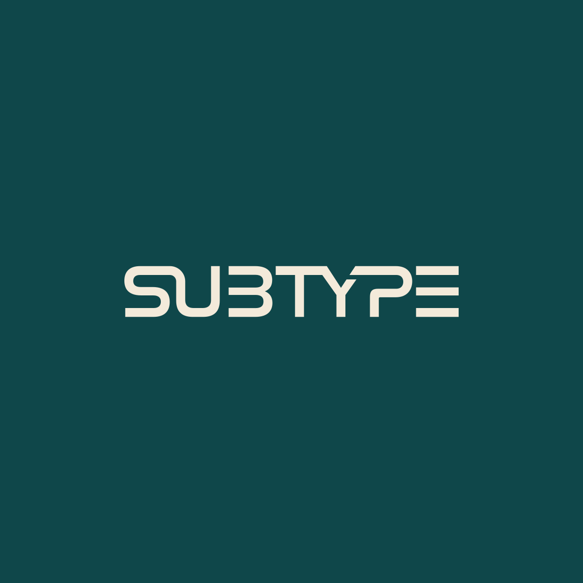
Like the new look and feel? We do too. After an inspiring visit to the local air and space museum, a strong appreciation for the technological achievements in 1970, primarily in the space industry, was held. Something about that era was…tangible. One could say it was “hopeful” or “optimistic” (save for some obvious tension), but looking at the technology that laid bare that brought humans to space…simply astonishing. A miracle.
One of the few things the U.S. Government did really well during that time, was the cohesive design language that was adopted. Tactile, something that conveyed modernity, neutrality, and a degree of efficiency.
Helvetica, plain, simple, vanilla. Something so…simple but yet invokes such a degree of potential. It’s hard to describe without coming off as a pompous try hard, but in my mind, it just works. It doesn’t need to say much, it just is. It’s stately, it’s commanding, but it won’t stab you in the back when you turn around.
The NASA worm logo, representing a modern and forward looking aesthetic. Eventually becoming the face of “borrowed optimism” or that “can do” spirit. While it was briefly retired in 1992, replaced by the meatball, it eventually rejoined its successor in 2020 with the SpaceX partnership (“We’re so back, baby!”).
In this day and age of AI slop and the continued enshittification of the internet, it felt there was a pull, not only with the next generation(s) to re-appreciate analog mediums and technology, but a desire to reconnect beyond the screen once more. We need to build things that connect one another on a fundamental, physical level. Not everything needs to be a high efficiency, profits over policy, 10000-things-in-1 glass slab, but purpose built. Look at some of the media and content being published today in the sci-fi genre. There seems to be an overarching theme (at least, in my opinion) of a desire to reconnect with this era of retro-futurism. Personally, I believe it’s because of that design language - that “feeling” - it captured those emotions discussed earlier so well: optimism, and a willing spirit.
There’s no specific rhyme or reason for pouring a sizeable amount of resources into subtype’s branding and identity other than pride and a personal emotional connection to what effective acts as a hobby persona. It’s just one of those things that bring a simple joy, and a subtle push to keep learning and building.
Looking back

The very first logo of _subtype – the first attempt of trying to capture an old-school feel of a terminal with a slight “edgy” feel to it with the cut ‘S’
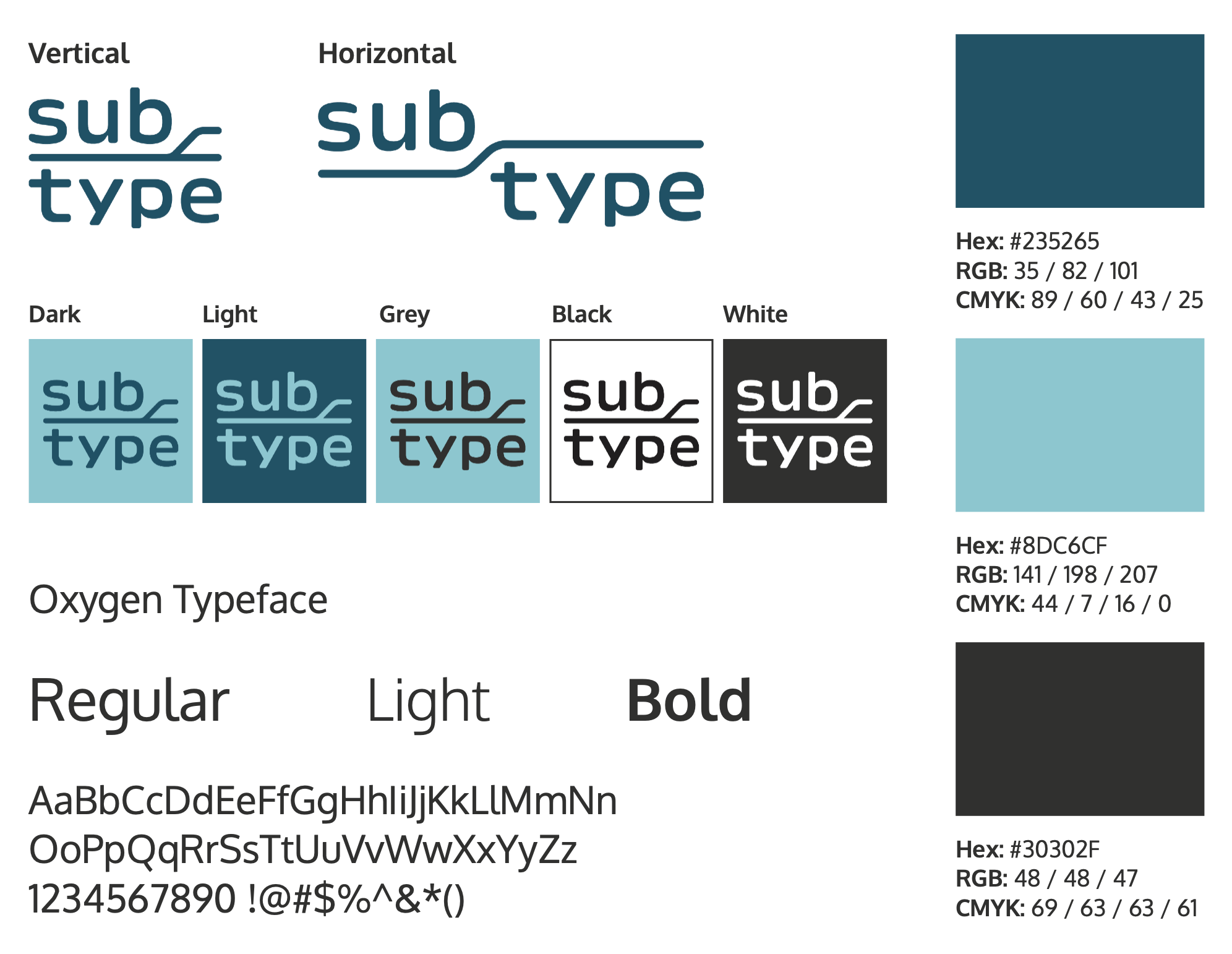


The 2nd iteration of branding, designed by Emeri Chase
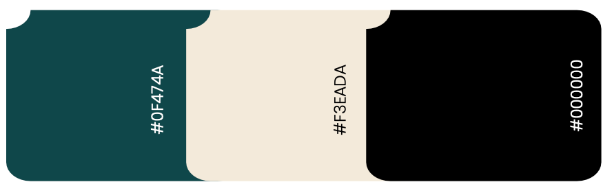

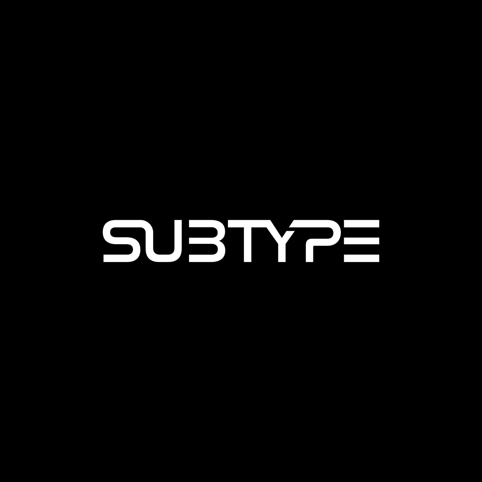
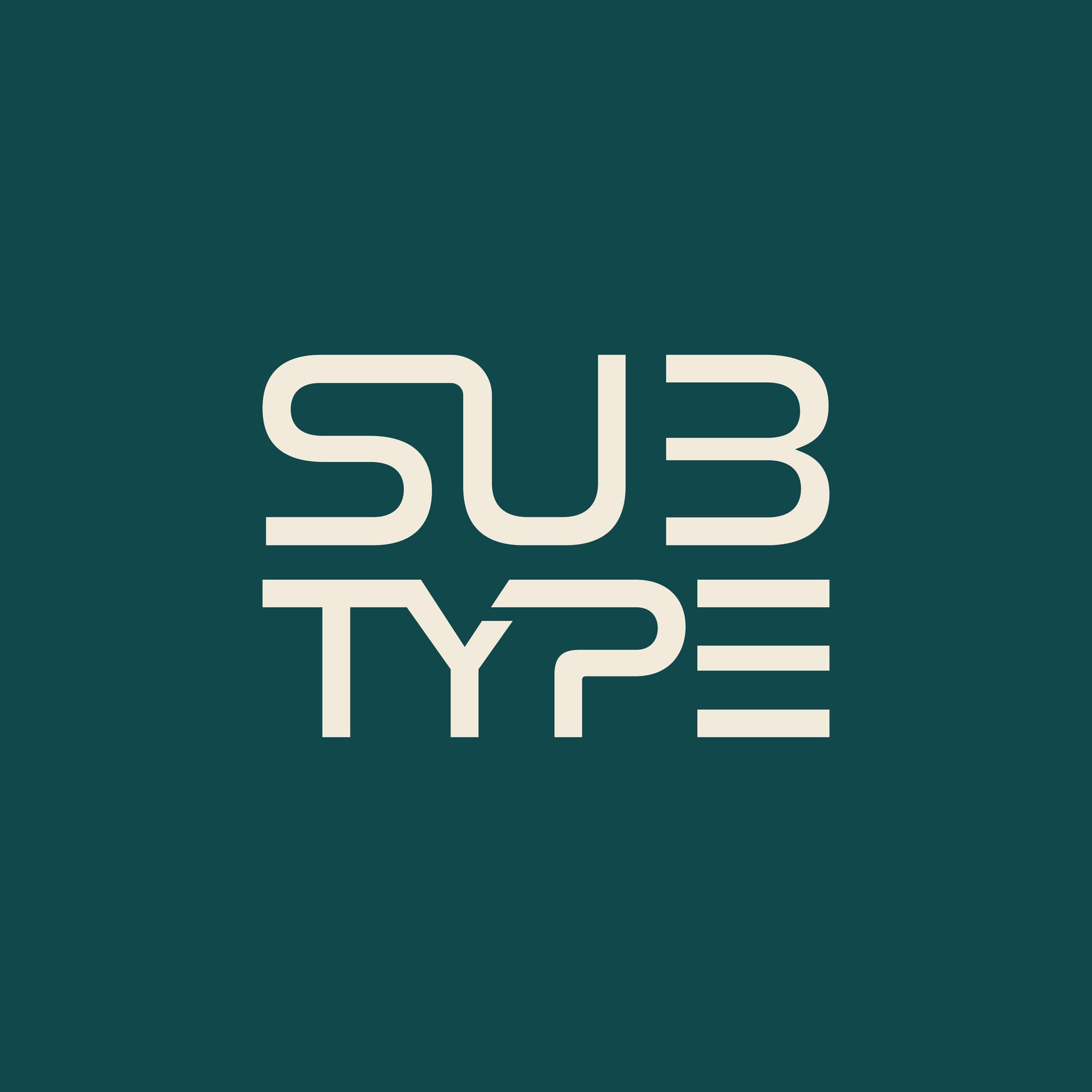
The latest iteration - an appreciation for the 1970s styling of retro-futurism, “borrowed optimism”, that can do attitude, and significant technological achievements due to a unified, collective push. Designed by x_studioz